Sure I like the classy stuff, graffiti that sends a message or a mural of sorts done for the community, it's the tagging mostly I don't understand. Is it a form of bragging rights? If you tag a high building does that make you ..."cool"?
I really don't know, why waste your time scrawling big stupid letters all over a wall when no-one can understand what the hell it's trying to say?
On and around the train I come across some of the dumbest graffiti ever conceived, some guys name with the standard "was 'ere" can be found in most carriages, and in the bathrooms of the newer trains some git has written "SLAYER ROOLS" above the loo. Some of it pisses me off because it looks like shit, but other times I just have to laugh.
I think the graffiti world needs some critics, to keep the Uwe Boll's and Michael Bay's of tagging in line, whilst praising originality and creativity.
I've prepared some critiques for your enjoyment, I won't be praising anything today though, because that isn't as fun.
 The Hit and Miss
The artist starts strong proclaiming their love for music, but hits an early bump when drawing comparisons to what they don't like. I feel a better message could have been brought to our attention if the artist chose to focus on a more specific hatred, and not generalised with "stupid shit".
I'm afraid that vague remark wasn't the only mistake the artist made, his message decimated further upon the reader finding out his music taste is cornered on the little known Hillbilly Revolution. The 80s' style pink and blue chalk "YOU" behind it is the final nail in the coffin. You tend to find this style in bathrooms where the artist has enough time to think their design over, and even more time to stuff it up.

The Self Fellate
Abdi is a G.
My understanding with graffiti is that people use painting and marking techniques to send a message to anyone who may read it. I'm afraid this artist completely missed the mark.
The Hillbilly Revolution, as hilariously bad as it was, still sent the message of what the artist believed in. This does not.
Abdi is a what sir? a Goat? a Grandfather? a Great Lay? a Georgian Male? I'm going to assume that G means "gangsta" using the common street spelling, and I'm also going to take a wild stab in the dark here and say the artist is none over than Abdi himself, trying to inflate his ego with bad handwriting.

The Inept Threat
Here is how one can improve their graffiti
1) invest in a dictionary
2) Be consistent with your upper and lower case lettering
3) Eliminate the unneeded "If read this", firstly you're missing a 'you're', secondly, let's just assume that people looking at this sentence are already reading it.
4) You should really have some backbone to your statement, if we are indeed not(h)ing, at least give reason
5) Try not to use those little circles above your letter i, it promotes a liking for Disney.
 The Penrith Newsagent
I'm guessing the black says "Josh", and while I do like the dollar sign on the O, I don't like the inverted commas, it gives the appearance that Josh is crying.
And would it hurt Josh to mark his name on EMPTY brick? there is a gap above the pipe, hell you could use the pipe for an underline, making the crying josh more prominent.
This is the problem with most taggers, their heart is in it temporarily. Josh had a great idea for his name, although I have no idea why anyone would bother to pay attention given the number of Josh's in the city, but he didn't even bother to clean his workspace, nor fill in the gaps with a hint of colour.
This style I like to call the "Penrith Newsagent" as I saw this many times when growing up. The graffiti artist would get the idea for tagging at the spur of the moment and rushes to the local paper shop to buy the biggest black marker he could find for the amount of change he has in his sock. Then the artist quickly tags the building and leaves the area via Bus.
 The Good Intention
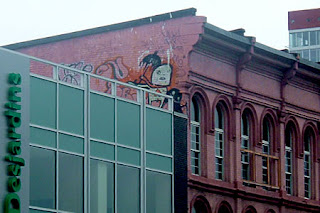
You got to the very top of a building, found a prime spot for maximum exposure, and then what did you do? You tagged a PINK building RED you twat! And that umbrella character would suit the expression "HURRR DURRRR". Also note the wasted space at the top, that's prime real estate you missed out on there.
 Miss Clarendon's 1st Grade Class
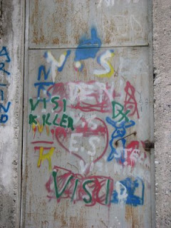
My eyes are ablaze with horrid colour! This looks more like a group piece than a solo effort. I especially enjoy the Green "VISI" with red colouring at the bottom. Surprisingly enough for a piece that uses so many letters of the English language, there appears to be only one complete word in the mix.

The City Planner
Perfect Real Estate, it's a street level building that backs right onto the sidewalk, and there is one bland colour, easy to cover with your art. But in a rush to claim the space, the artist failed at deciding what to write! The message is lost completely and the big crosses over the failed work really shows how much of an amateur the artist is. Hang your head in shame.
Here's hoping a more "switched on" graffitier comes along and takes advantage of the space to draw something with meaning, like a big penis that says "you r gay".

The Home Plate Stumble
The message is perfectly suited for this style of graffiti, a simple text message on a stark white wall, an artist shouting at big brother, fighting back against the oppressors. And they even went the extra mile to throw in a bit of parody, lampooning the old windows 95 shutdown screen. But the message is destroyed through a lack of proper spelling and an unwanted exclamation mark.

OFHLAH!!!!!
Words cannot express what I'm feeling.... was the person having sex and described their 2 second orgasm in words?

1 comment:
haha, this is great.
most of the graffiti i see is just pointless.
Post a Comment